Research
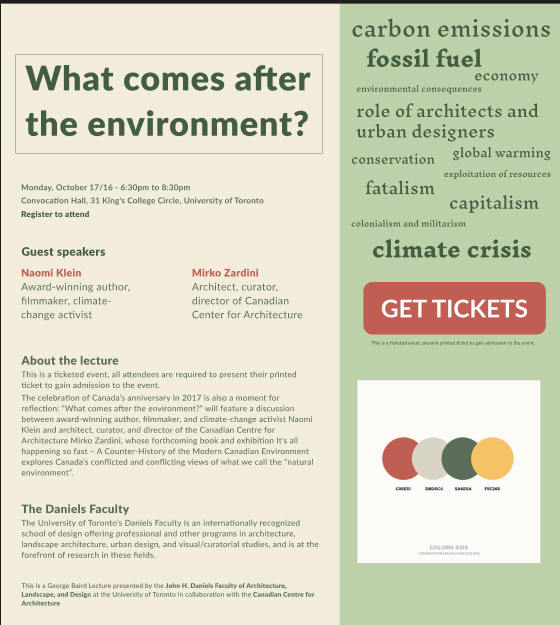
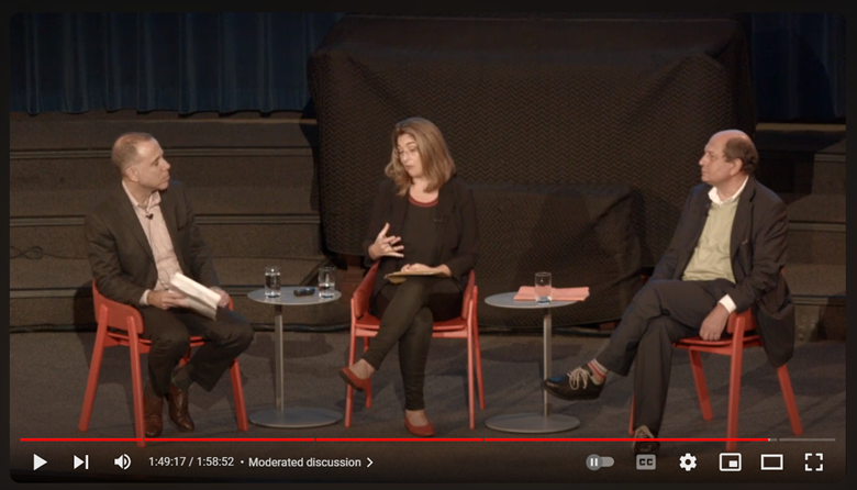
In search of inspiration, I watched (scanned through) the lecture video uploaded on YouTube. I noted down a number of keywords that I think were highlighted and gave a glimpse of what terminologies would be touched on in the lecture. I also researched the work of Naomi Klein and Mirko Zardini. These keywords gave me an idea to display them on one side of the page and the other would be content related to the event.
Fonts
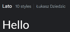
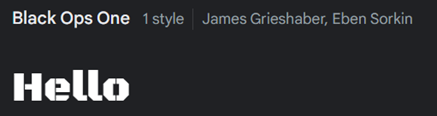
The keywords I used to search for fonts I looked were - were clean, clear, easy to read, and bold, which would stand out as important. Lato and Black Ops One of Google Fonts are used in this project. I used Lato as it is easy to read and clean, I believe one of the most important factors of a poster should be that it should be readable. I used Black Ops One for keywords – it is a font used by the military, and it is heavy, sturdy, and punchy. My intention was to highlight the keywords as they are important factors of an ongoing real-time issue in the world, and they should be bold and loud and get the attention of viewers.
Hierarchy
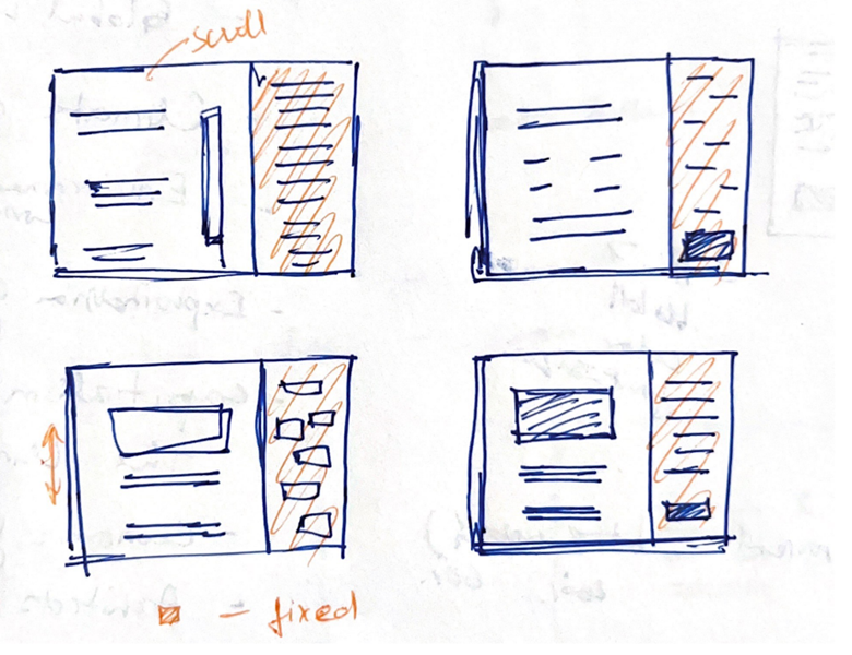
I divided the page into two parts, the left was scrollable with all content related to the event, and the right was fixed with keywords. The left side was then divided into sections with the name of the event in big bold letters on top which should be the first thing that is seen by viewers. Then right below the text was location information and a link to book the tickets. One can scroll and get more information about the event or look over to the right side of the page and read through the keywords.
Design
I selected a color palette and organized the content in Figma. Added links to pages – the main topic is a clickable link, names of guest speakers get one to their respective pages, and “get tickets” and “register to attend” are links to the same page. The footer also has links to pages of text in bold. I also added some animations like hovering over the “get tickets” button makes the button bigger in size, and hovering over each keyword changes its color.